No Place Like Home - Switch Up on Holiday Colors
Hi Friends!
I'm sharing a card today that I just love because of the unusual colors, given the theme of the card. With the holidays fast approaching (especially Thanksgiving here in Canada), I've got holiday cards on my mind. But this time around, I wanted to incorporate a bit of a different palette - one that I wouldn't typically use this time of year. I found that with a few little tweaks, it actually works pretty well. Whaddya think?

To start this card, I used a white card base. The first tip about taking brighter hues into the fall season, is to actually season your whites! Yes, you read that right!
Instead of leaving whites as they are, I add just a smidge of tan, brown, or grey ink to the edges, and it instantly gives the card not only an aged look, but a much more fall-appropriate look. Don't you think?

Next up, when using greens, I love using warmer hues as they really emulate the golden harvest sun on those last few remaining green leaves. And then I build my palette around that. I used the same colors I would use any other time of year, in this case, blue, yellow and peach.
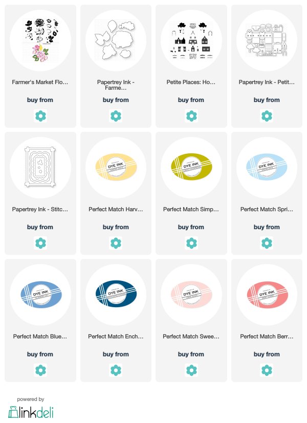
To incorporate these colors, I used the gorgeous Farmer's Market Florals stamp set from PTI. I used ink colors of Harvest Gold, Simply Chartreuse, Ripe Avocado, Spring Rain, Blueberry Sky, Sweet Blush, Berry Sorbet, and Enchanted Evening.

Last but not least, I try and use cozy, home-y accents. In this case, the sweet and adorable little house from PTI's Petite Places: Home and Garden stamp set. I love, love, love how much a touch such as this instantly adds a cozy feel to a card, regardless of the colors used. Here though, I used the same colors as I used for the florals.

I also added a few little borders of patterned paper, cut with PTI's Banner Borders die and a Stitch in Time die, and the tag is from PTI's Tag Sale #4 die.
Thanks so much for joining me today friends!
Ivana


Comments
Post a Comment